 ×
×
PROJECT - BELLTOWN CONDO REMODEL
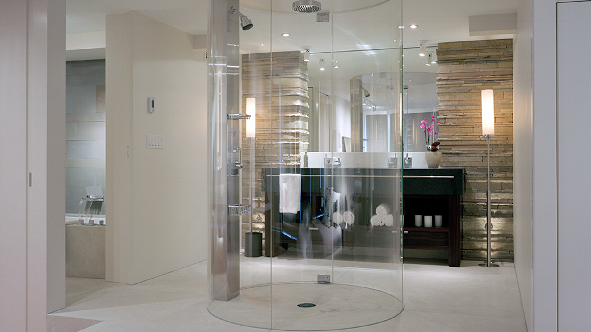
A dramatic design strategy gains space and light for the master suite in a high-rise condo. Designer Garret Cord Werner created a bath with an open, flexible floor plan and a scene stealing glass shower column for a high-rise Seattle condo. With his remodel for a 1970s Seattle condo, interior designer Garret Cord Werner proves that a small space can make a big impact. The entire twenty- fifth- floor residence measures about 1,200 square feet, but it’s the master bath where Werner’s design ingenuity commands the most attention, “The client wanted the bath to feel like part of the whole space,” says Werner, who transformed the three-bedroom condo into a large, open area with one master suite. So instead of separating the bath with doors and walls, Werner left it open to the master bedroom and defined it by raising it one step. “This also allowed us to redirect the plumbing under the floor, without having to core through the cement slab,” says Werner. The higher level created a vantage point for looking out through the bedroom windows to the harbor.
A Werner designed Macassar ebony vanity is flanked by stacked limestone and custom torcheres. A stainless-steel column bolds a showerhead and other fittings from Dornbracht, whole a second shower-head is mounted to the ceiling. The vanity sink was made by hand out of 3/4 – inch-thick Zimbabwean black granite.” We also designed a custom drain that’s a linear series of stainless bars,” says Werner. The faucet is from Dornbracht. To make the most of this view, Werner designed a freestanding cylindrical shower made with clear glass that rises seamlessly to the ceiling’s full height. “It’s definitely the focal point,” says Werner. “But we didn’t put any wild texture on the glass or try to jazz it up. To me, the simplest things are often the strongest.” The clear glass allowed the back wall, which has two panels of stacked limestone flanking a custom vanity of Macassar ebony, to have a strong presence.


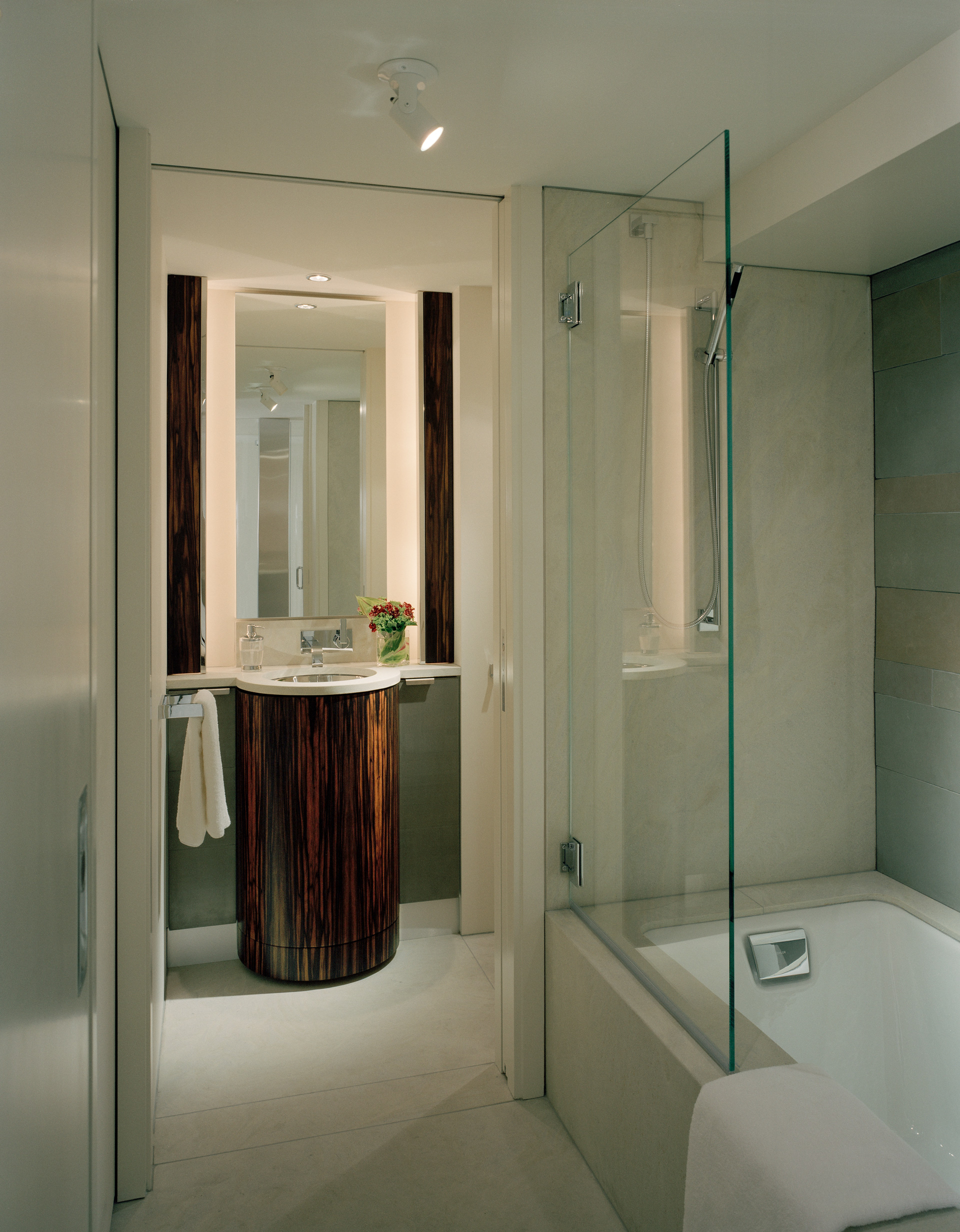
“The limestone was hand- cut and laid up in the space,” says the designer. “With the clear glass and the stone walls you feel like it could almost be an outdoor shower.” This sense is amplified by small landscape up lights that illuminate the rough stone. For continuity, the same materials are repeated in the bath’s small self-contained section that houses a tub/shower, a vanity and a toilet. A pivot door connects this area to the main bath space, and a picket door slides open to an adjacent hallway through which guests can enter. “It’s one bathroom,” says Werner, “but it functions as two.” “Bathrooms today are much like kitchens in that they’re becoming a focus of the home and of the design,” says Werner. “It’s an evolution based on modern thinking and living.” Werner center- mounted a faucet from Dornbracht’s Mem line over Kohler’s Tea -for- two tubs. “The faucet has simple lines and creates a cascading, waterfall effect, he says. In the self-contained area of the bath, Werner designed a cylindrical vanity that mimics the shape of a tree trunk. A glass panel keeps water in the shower and swings open for access to the tub.
Bath Ideas
-A cylindrical glass shower makes the most of the small space. The glass is flush with the floor and ceiling for a smooth appearance, and the floor was sloped just enough to let water drain.-Werner gave the floor plan flexibility by separating one section- which contains a vanity, toilet and shower/ tub-with a hidden pivot door.-By raising the floor one step, Werner created a platform for taking in the harbor views and used the space to conceal redirected plumbing beneath.-For a consistent feel, both of the vanities were make with Macassar ebony, and he used limestone- stacked on one wall and laid flat on another- for texture.-Landscape fixtures were used as up lights beneath the stacked limestone walls for an outdoor effect and were ceilingmounted above the vanity mirror, where recessed lights wouldn’t fit. Custom floor- mounted torcheres take the place of sconces.-Werner chose fixtures with simple lines from Dornbracht’s Mem collection. The waterfall effect created by the faucets adds to the outdoor feel.-As a foil to the Seattle weather, Werner kept the walls white and used a pale quartzite stone from Lambert Marble & Tile Works for the floor.
Publication – WESTERN INTERIORS + SEAMLESS IN SEATTLE
Published – 2007