 ×
×
PROJECT - CYLDE HILL MID CENTURY REMODEL
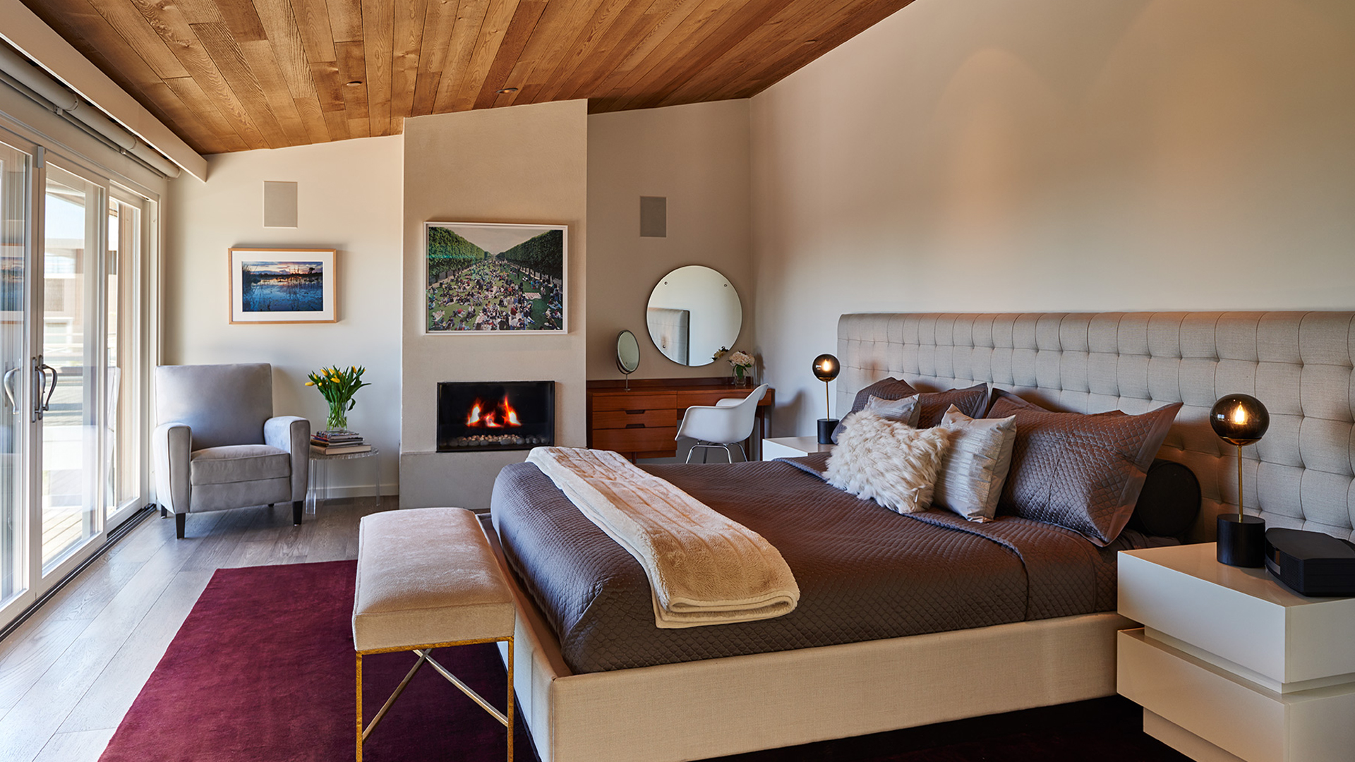
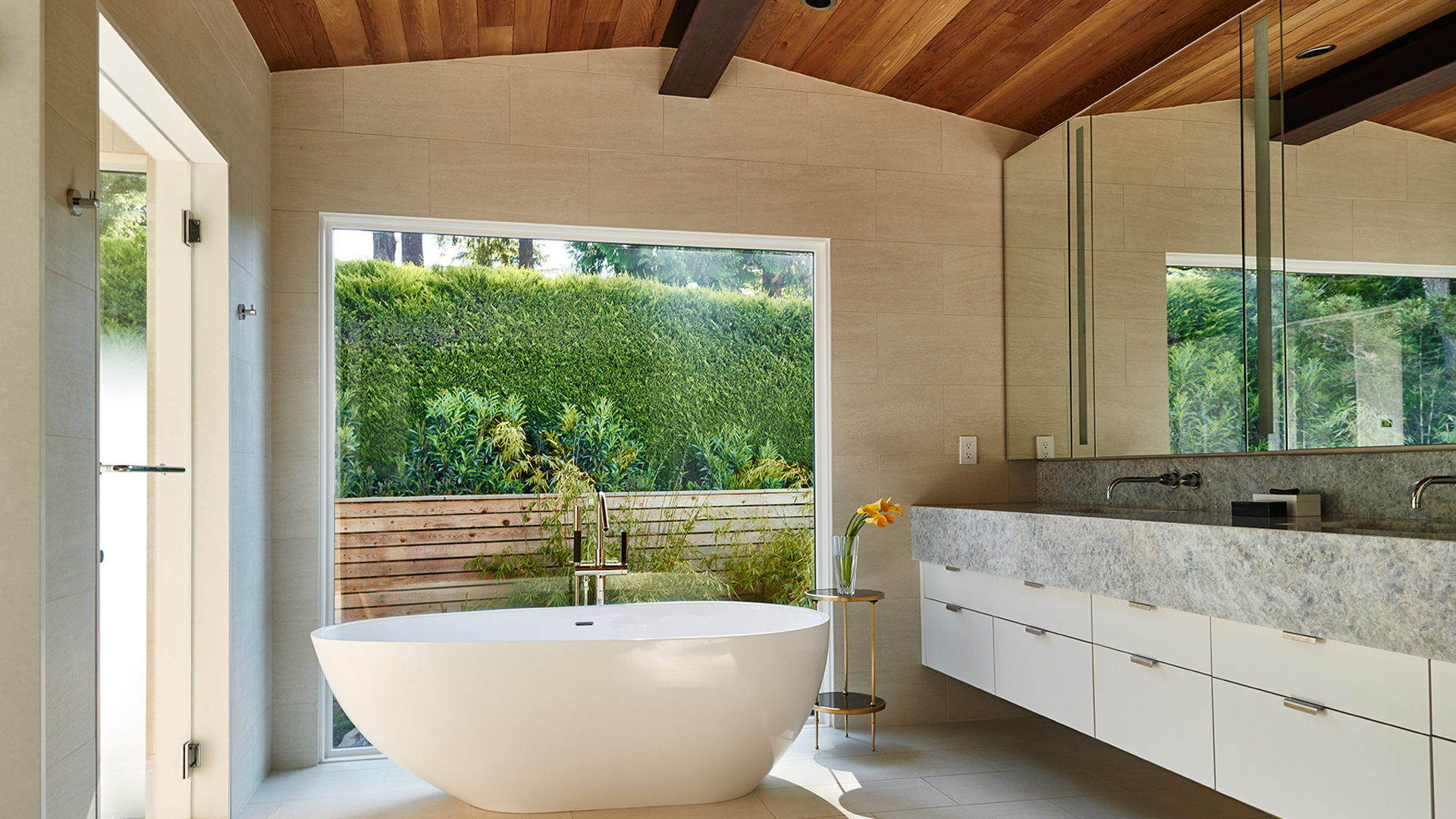
Residential designer Garret Werner is very clear about the foundations of good design. “Repetition and balance are two of the keys to a successful house,” he says, stressing, however, that the repetition needs to be done in ways that are surprising and perceived almost subconsciously. To those ideas he adds the importance of aligning visual elements, pulling furniture styles from one room to another and judiciously using color. “These are essential,” he says. Werner brought those notions to bear recently, converting a basic mid-century box in Clyde Hill into a home graced with light-filled volumes and a Zen-meets mod aesthetic.
Homeowners Valerie Wasserman and Scott Moore took their time before embarking on any renovations, living there for three years. “We wanted to get to know the place,” Scott says. One thing was for certain, though: “We’ve always loved the view,” Valerie says. To preserve the spectacular vista stretching across Lake Washington, Werner determined that scraping off the existing house and starting anew would necessitate moving the residence down the site because of building codes. So instead, they decided to strip the place down to its bones and build a completely fresh structure on top of the existing walls and foundations.
View preserved, Werner set out to better connect the house to its surroundings, a critical element in all his work. Notably, he revamped the interior’s layout, allowing the master bedroom and other rooms to open to the vistas. The staircase also received an overhaul: Werner pushed out the mechanical room wall to align with the floor above to create a single volume and used glass railings and open treads.
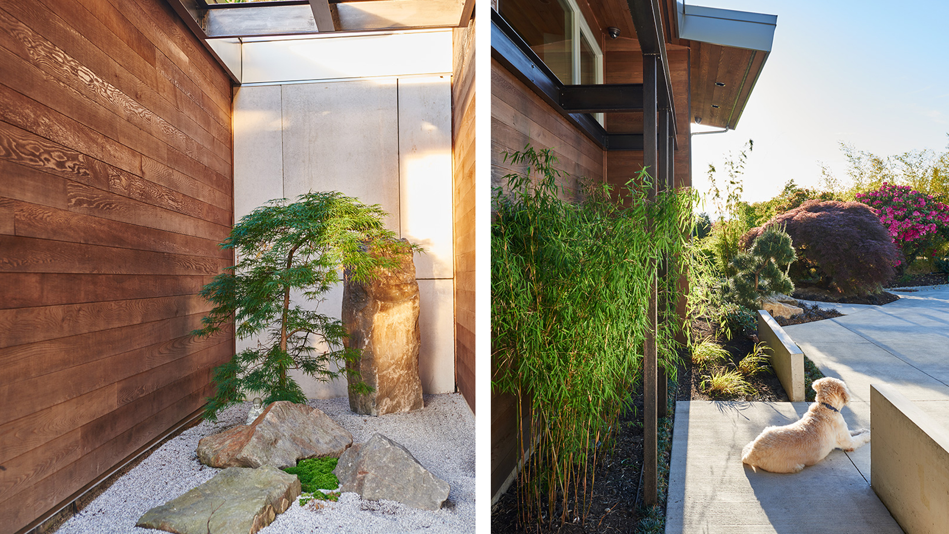
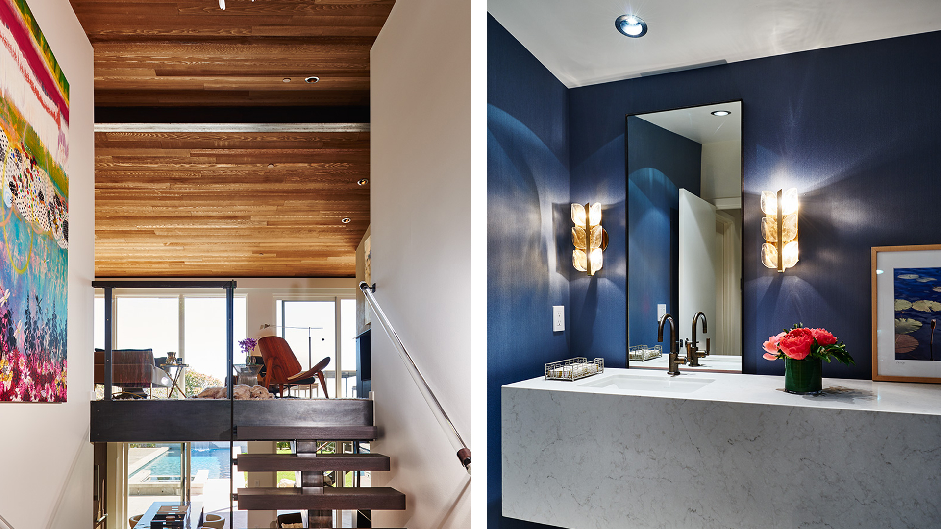
Glass along the south and entry walls also helped, as did relocating the sport court and pool and adding a large covered outdoor seating area. “All you see from the inside is a meticulously landscaped pool and yard area, with a nearly unobstructed view of Lake Washington and the Olympic Mountains and even Mount Rainier on a clear day,” he says.
To provide spatial definition and to draw visitors in, Werner placed two low concrete walls at the front of the house. Behind them, adjacent to the front door and on the site of a former storage shed, he created a calming Zen garden complete with Japanese maple and raked gravel. “Enjoying this little space has reawakened my meditation practice,” Scott says. The steel trellis enclosing it foreshadows the acid-stained steel framing inside that holds up the cedar-paneled ceilings in the rooms on the upper level. “The entry sequence creates a visual path of interest from the outside world right into the heart of the home,” Werner says.
At the heart of this home is an expansive living room featuring a wall of glass and low, wood-clad ceilings anchored by a fireplace mass covered in steel. It fits Valerie and Scott’s aesthetic to a T. “We love the spirit of midcentury modern,” says Scott. In that vein, furnishing the space are an Eames lounge chair and a Carl Hansen CH07 chair, both of which Scott purchased when he was living in Southern California. Valerie and Werner agreed, though, that they didn’t want the room to look like a showroom. To balance things out, Werner custom designed a plusher pairing of a sofa and a chaise.
“We needed a strong piece that would complement our living room space while taking advantage of the sweeping views of Lake Washington,” Valerie says about the sofa. “Comfort is obviously also important, and the sensual curvature of the design works well in social settings when we entertain.” Chic, the sofa is covered in Holly Hunt outdoor fabric, making it resistant enough to stand up to the couple’s children. The settee, covered in mohair, is intentionally stylistically ambiguous. “We were after timeless,” Werner says. The dining room similarly incorporates midcentury furnishings, such as Robsjohn-Gibbings chairs and a table.
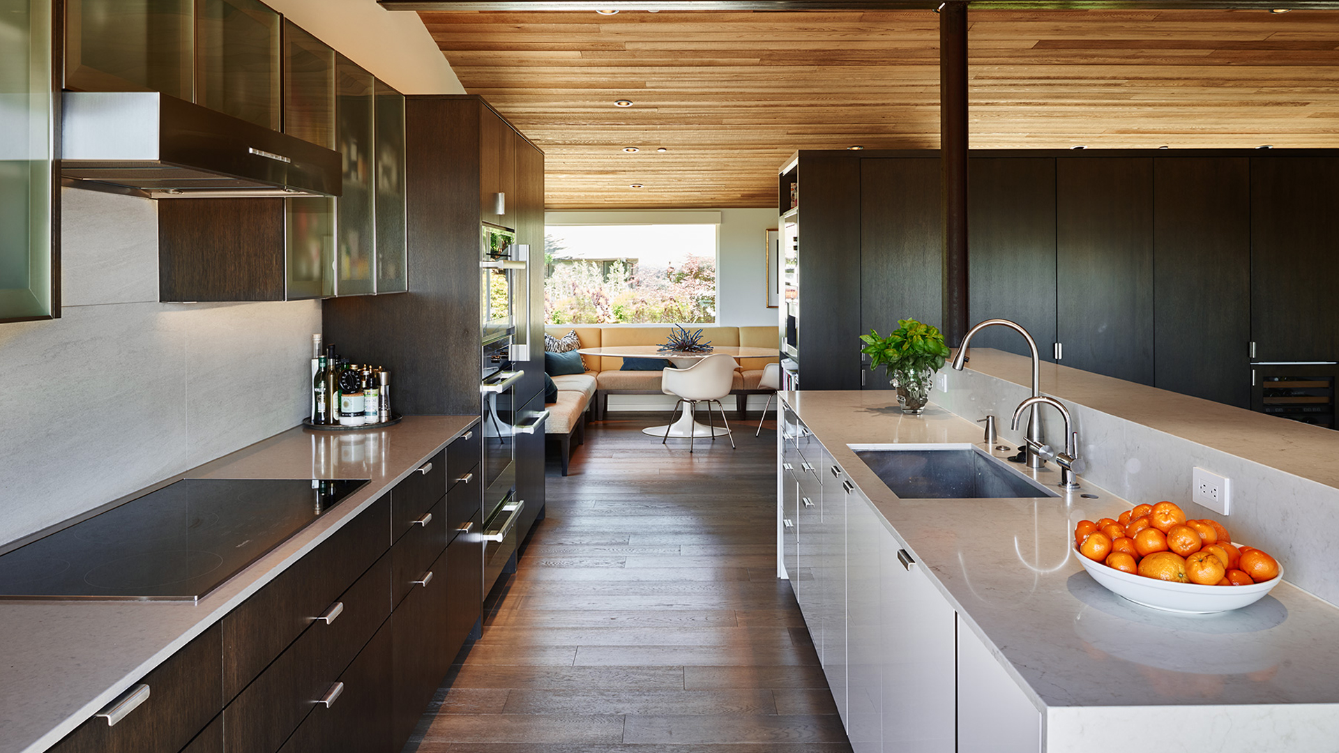
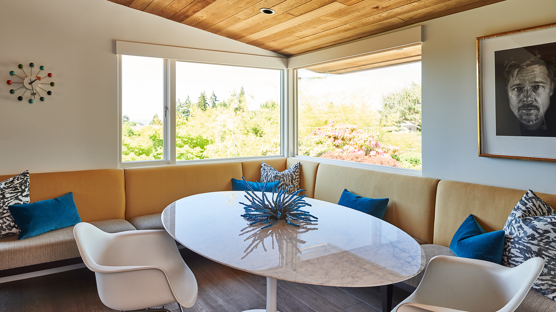
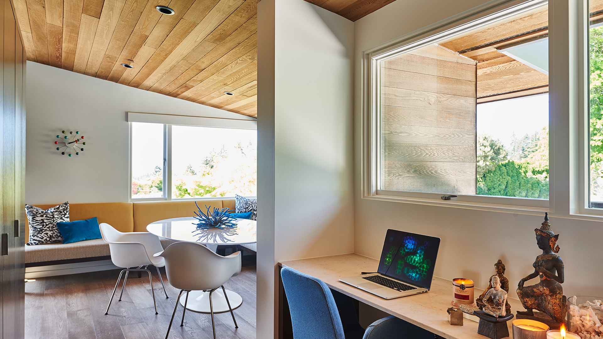
In the original house, the kitchen was a long dark galley with very little natural light. Werner opened it up to both the view and the dining room, separating the space from the children’s study area and the breakfast nook with a bank of storage cabinets finished in the same dark color as the kitchen cabinetry and the steel support structure. “There needs to be variety in any home, but there needs to be a consistent design to tie it all together,” he says. That explains why he snuggled a Saarinen table and chairs up to the breakfast banquette—to help tie this space to the living and dining rooms. The yellow fabric on the banquette echoes the yellow in
the cedar ceiling and the blue of the pillows is picked up from the nearby powder room. “This is the hangout zone for kids and adults,” says Werner. Brad Pitt also hangs out there, or at least a portrait of him by Chuck Close—a piece from the couple’s burgeoning art collection.
With Valerie and Scott’s enthusiasm for their residence and after Werner’s thoughtful intervention, personality now infuses the home. “The beauty of this project is how from the moment you enter the property, you are directed by the design and led by visual pathways—at each turn the eye experiences a focal point and a forced perspective,” Werner says. All it takes is a focus on the fundamentals.
Publication – LUXE MAGAZINE
Published – 2017