 ×
×
PROJECT - LAKEFRONT CONDO
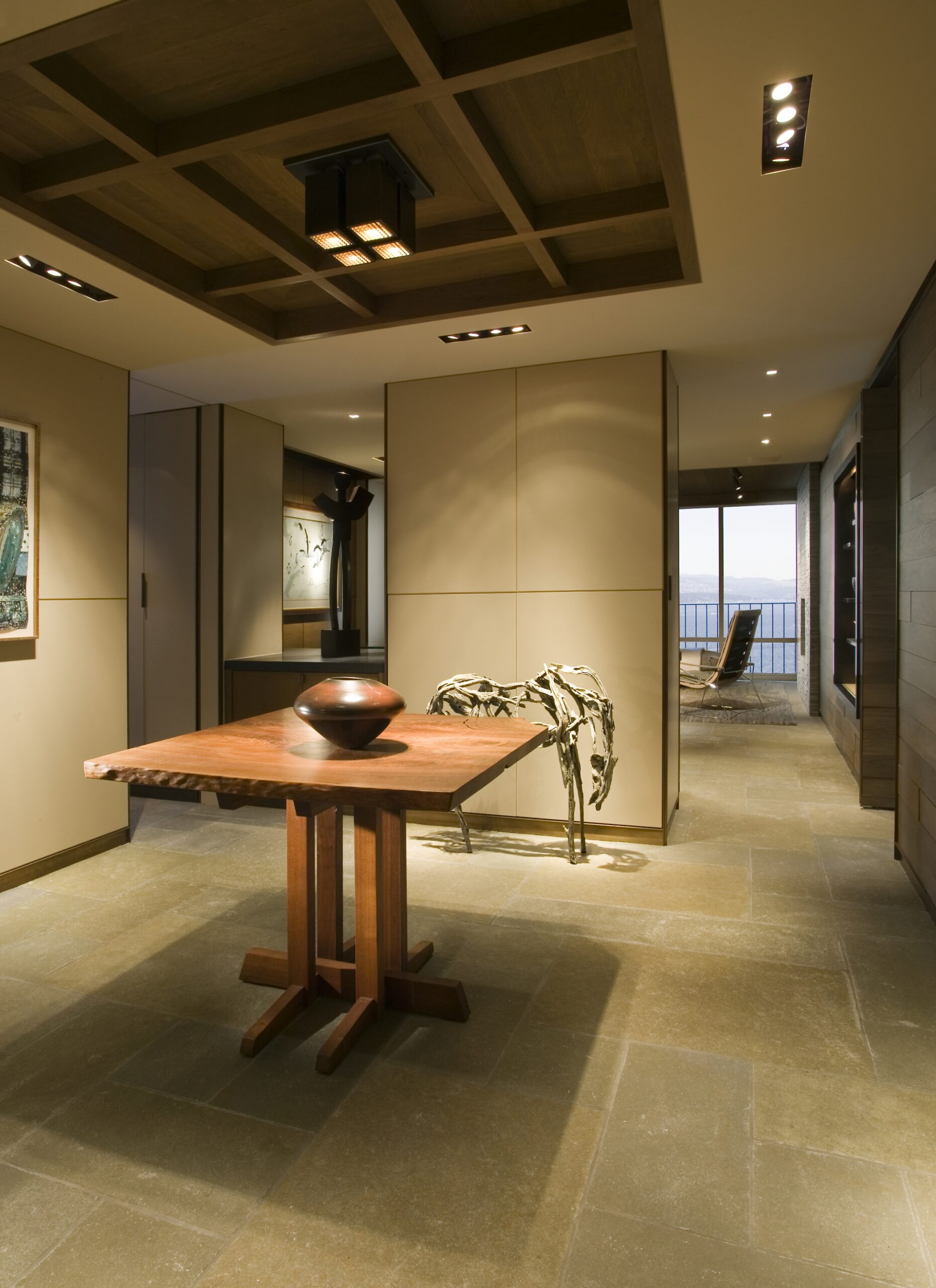
“The client wanted a really neutral palette with really calm color tones,” interior designer Garret Cord Werner says. “It is less condo-like and more residential to use these more natural and organic materials, to make it feel like you’re living in an outdoor space.” The fireplace limestone is the same as was used on the floors, but placed on its side and cut. The television is hidden in the wall to the left of the fireplace. George Nakashima and Deborah Butterfield are a practically royal welcoming committee there in the entrance hall. His black walnut table, her horse sculpture. Each so lovely and perfect one hardly notices Lake Washington and its mountain tiara just outside. The views in this Madison Park condo, in a building designed by Roland Terry,are both near and far. And they are elegant- from Peter David glass at the front door down to the limestone floors- in a modern reinterpretation of details used in the couple’s Medina home.
But in spaces that flow with such ease and grace in 2,200 square feet, you would never know it was a fight to the finish for storage, storage and more storage. “They lived directly across the lake in a house designed by my dad,” says architect Steve Hoedemaker of Bosworth Hoedemaker Architecture. “A beautiful house on the lake. Big, big rooms and a big garden. So we brought outdoor things in,” he said. This explains the use of natural materials in this waterfront home, freed from a warren of spaces and warped parquet floors.

“Every square inch was used if we could use it,” says owner Nancy. And everything that resides therein was measured and considered. Even the art. “But there were pipes and wires; we had to fight for every inch,” Hoedemaker adds. “We were drawing until the end because as we got in we learned about more limitations and opportunities.” Ever the condo conundrum. But here beautifully solved by Hoedemaker and interior designer Garret Cord Werner with additional pieces by Christian Grevstad.
The dining room sits under the soft glow of the condo’s custom lighting. “We wanted to use these multiple-headed, recessed fixtures to keep the ceiling clean,” Werner says. “Also, those fixtures have no trim.” Werner designed the custom bronze fixture over the coffee table. The entrance features a George Nakashima table and a Deborah Butterfield sculpture. “This room serves as a nucleus,” Werner says. “From this room you can go into the kitchen, the master wing, the living room. It’s like this little hub you come into. It’s not only beautiful it’s a very functional space.” The floor is limestone.
The client wanted a lot of quietness in the bedroom, so a lot of upholstery was used, including on the wall behind the bed and on the headboard. “This is one of the few rooms that has wall-to-wall carpet, and that was used to soften the noise,” Werner says. Silks, raw linens and fine wools add texture. Werner designed and built the bed and nightstands, which have built-in tea trays.”All this utility behind all that beauty,” Nancy says as she pushes on the horizontal walnut siding that runs the length of the condo. Out comes the television. Hidden in the wall nearby is an entire door. It leads to the guest suite. And then there are hidden closets for coats
and utility items.
The theme in the kitchen is cabinets, cabinets, cabinets. Walnut with oil-rubbed bronze pulls everywhere. On the wall, in the kitchen island, over the counters. Even the dishwasher and range hood have been disguised as drawers. “We were having fun with cabinets and pulls,” Hoedemaker says of it. Huge pullouts there were designed to hold Nancy’s collection of Native American blankets. Another drawer holds photographs.
Elegance travels a thin yet strong line along the walls of the condo, seen in the reveals and angles of rubbed bronze whenever two corners meet. The already low ceilings (another condo constraint) were modulated to create relief, walnut used on the higher elevations. Nancy is a knowledgable docent for the couple’s art collection. The book “Navajo and Pueblo Silversmiths” sits on her desk. Her office, large Indian rug on the floor is tucked away off the master so she can crank up opera music while she studies. Her husband’s office, however, sits out in the open, just off the living room. Both spaces, however, share a captain;s-eye view of
the lake. ” My husband is like a moth,” Nancy says. “He’s attracted to light.” The couple bought the home in 2003 and moved into it in 2006. “We love the space. We love the neighborhood,” Nancy says. “It just took 2 1/2 years to move three miles.”
Werner says he and architect Steve Hoedemaker originally drew a much bigger island in the kitchen, but “when we mocked it out it looked like somebody parked a car in there, so we reduced the scale.” The island has a lighted glass panel on top that Nancy says makes any floral arrangement look professional. Werner designed and built the desk at far right for Nancy’s husband; bronze pedestals hold a glass top. It sits just off the living room as sort of a command central. Wires travel through the pedestals to a central panel on top. The glass piece behind is William Morris. On the left are art pieces kept in a bronze cabinet, built by Company K, on glass shelves.
Publication – PACIFIC NORTHWEST
Published – 2010