 ×
×
PROJECT - DUCHESS MANSION
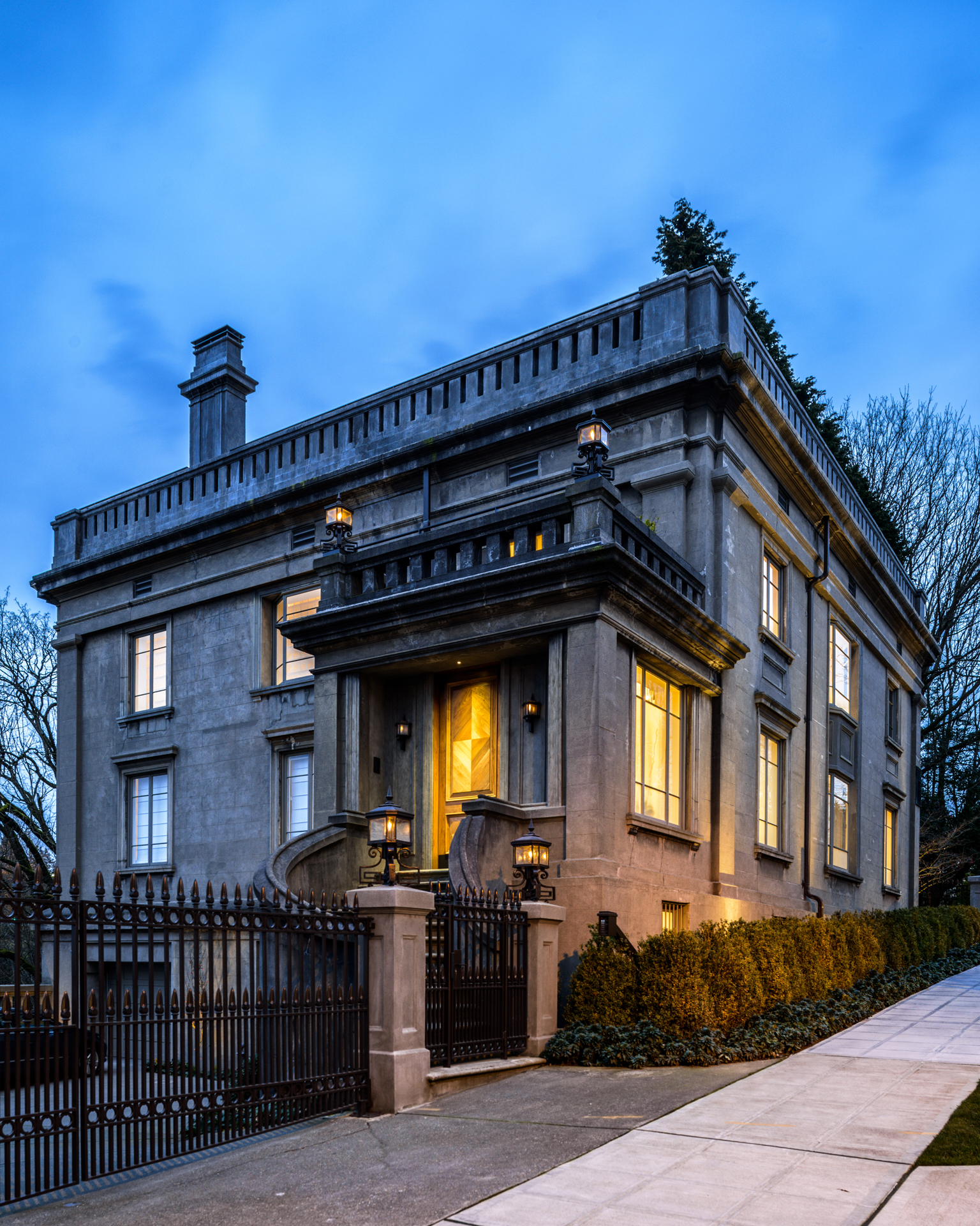
Under the renowned talents of Stuart Silk Architects and Garret Cord Werner Architects and Interior Designers, a 1909 Seattle landmark residence – originally owned by Samuel R. Hill, and known as the Duchess Mansion – undergoes an extensive makeover that pays homage to its history, industrial structural elements, and dramatic vistas.
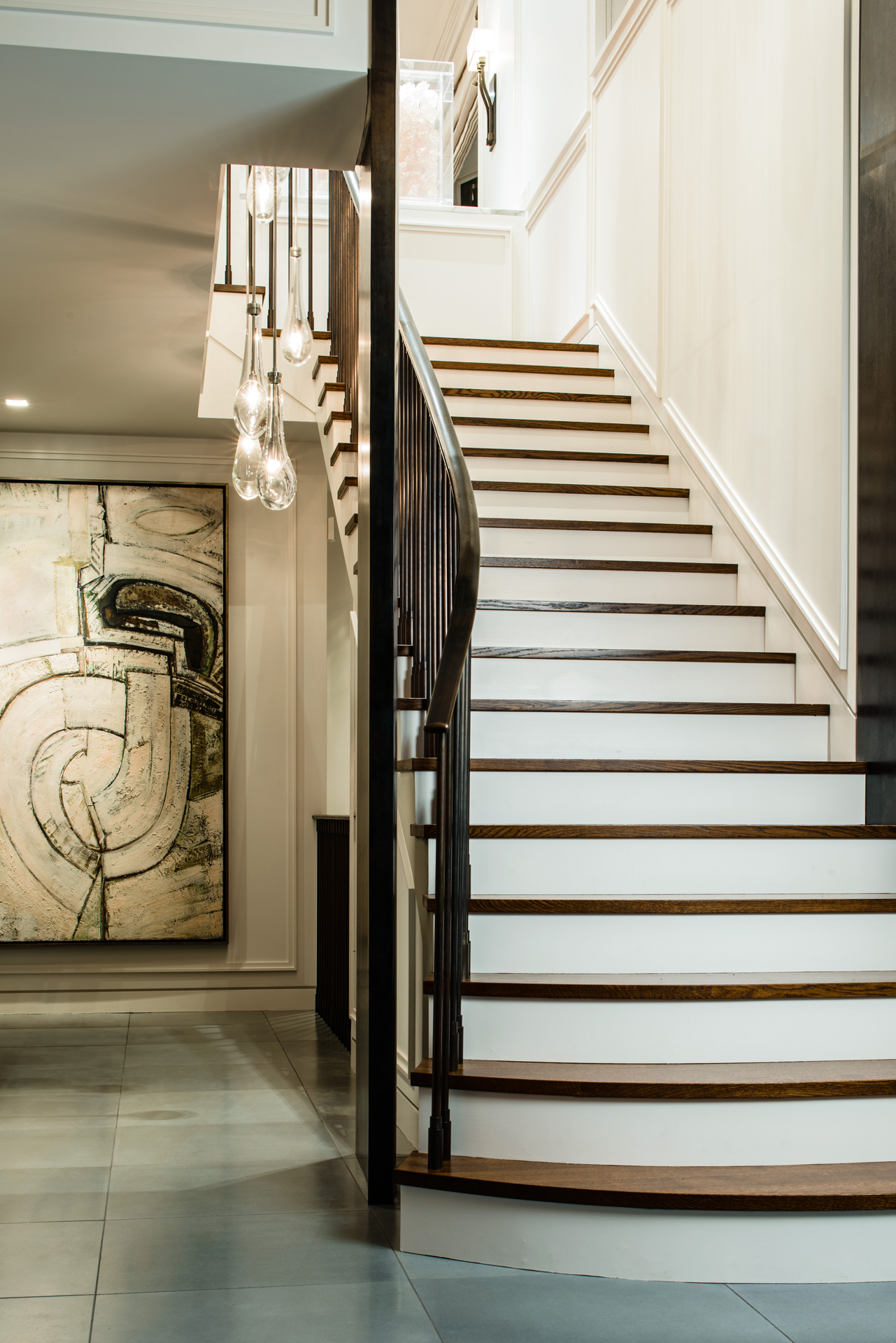
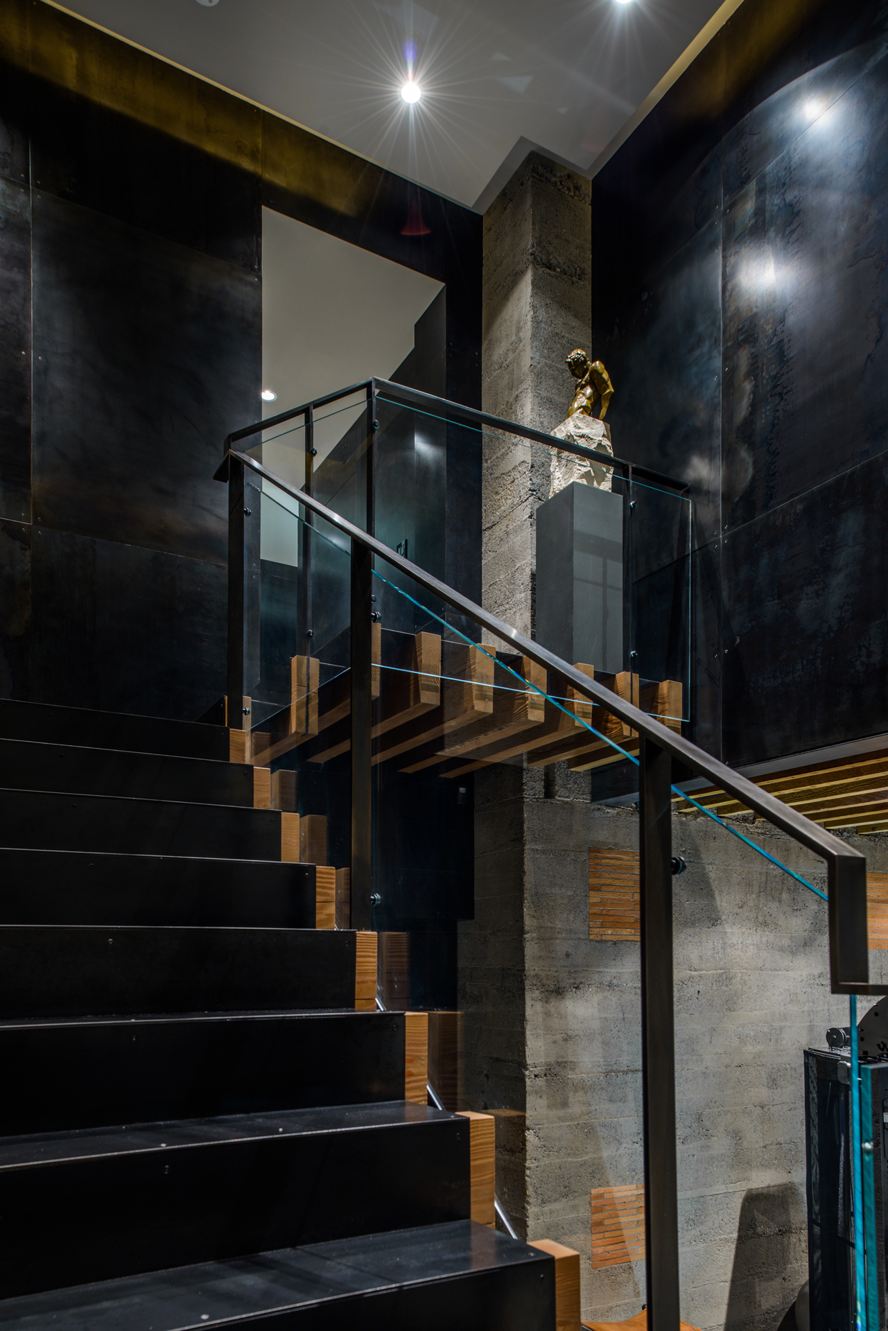
The massive interior reconstruction of Sam Hill’s Seattle mansion by Stuart Silk Architects required demolishing every interior wall, and relocating the entry stairs. Garret Cord Werner (GCW)’s chandelier fabricated by Stephen Hirt and Scott Chico Rasket creates visual flow. GCW refurbished the once electrified lamps to glow again with gas. This spread blackened steel panel sets off a traditional fireplace surround on the pent house floor. Cast glass bar top fabricated by Mike Danielson Studio is paired with Claudio Bellini bar stools. At night, doves perch on an architectural fragment.
Nearly 100 years after entrepreneur, lawyer, and railroad executive Samuel (Sam) R. Hill hired architects Hornblower and Marshall of Washington, D.C. to design his Harvard-Belmont District Seattle mansion, David and Rosangela Capobianco began a five phase reconstruction of the historic home with the help of Stuart Silk Architects (SSA), interior designer Garret Cord Werner (GCW), of Garret Cord Werner Architects and Interior Designers, and Charter Construction. Drawn first to Hill’s mansion architecture, reminiscent of Belgian châteaux he had visited during his travels in Northern Europe, Capobianco later became fascinated by its history.
In 1899, Hill, a Quaker, was considering a move from Minneapolis to Seattle with his wife Mary and daughter, both Catholics. During that same period, cast-in-place concrete became a sought after building material. Ten years later, Hill built not only his Seattle mansion in cast-in-place concrete, but also used it to build another residence overlooking the Columbia River on a parcel of land he named Maryhill after his wife and daughter. First envisioned as a Quaker Community of Farmers, it later became the Maryhill Museum, in 1940, nine years after Hill’s death. Work on a replica of Stonehenge also built with poured concrete began in 1918, but was not completed until 1930. Hill ammmmmmmrmmmlso built the Peace Arch on the border between the U.S. and Canada in honor of their lengthy peaceful relations in 1921.
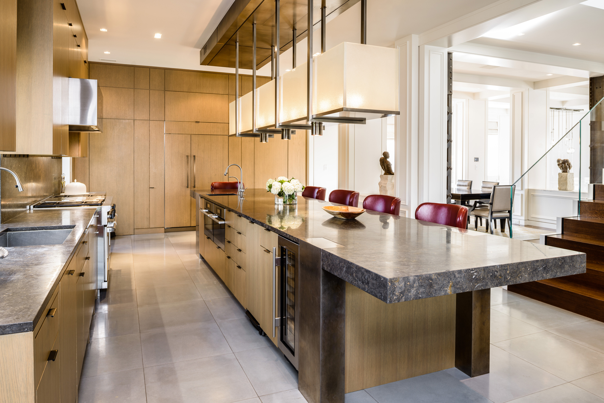
The Capobiancos chose Stuart Silk to reconstruct the mansion because his vision was consistent with their desire to retain the historic elements of the home, while creating a cleaner, more open floor plan that made better use of the sweeping vistas seen from its windows and terraces. Garret Werner of Garret Cord Werner Architects and Interior Designers was chosen to create a fresh approach to the interior design that would reflect both David’s contemporary modern style and Rosangela’s Brazilian flare for color and fun. “We knew the materials we wanted,” says Capobianco. “Italian marble, steel, wood, and natural concrete walls and floors.”
“This was a large undertaking that consisted of five different phases be-ginning in 2005, and lasting over a period of eight years,” says Silk. “We were hired because of our extensive experience and deep appreciation for historic architecture and our love for modern design. David and Rosangela wanted an architect who understood both and could reconcile them together into one seamless expression.”
“While the home’s exterior was historic,” continues Silk, “the interiors were not, because of earlier remodels. The house needed a wholly new vision, which SSA provided. In doing so, we developed plans that called for demolishing every interior wall on all five floors. Each floor was re-envisioned to meet their goals. On the main living floor, for instance, we opened up a rabbit warren of rooms to create a more open, interconnected plan that flows seamlessly. By cutting two large windows into the 12” thick concrete walls on the north side, we greatly improved the views and brought light into all corners of the floor.”
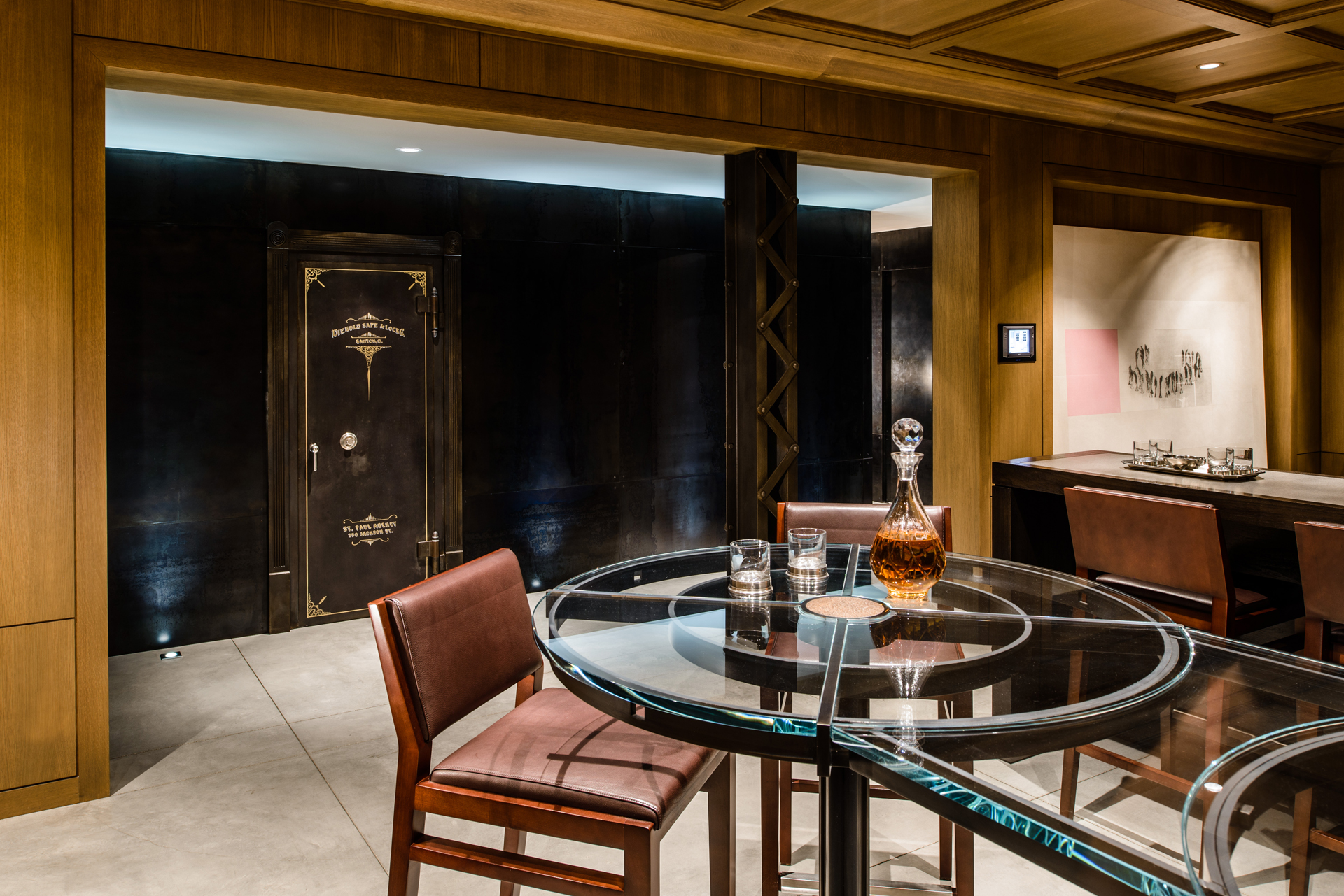
During Phase 2, Silk and fellow SSA designers Mike Troyer, Andrew Patterson, and Michael McFadden found remnants of the turn-of-the-century way of life as they deconstructed the five story, 11,100 sq. ft. home – once known as the Duchess Mansion after a European duchess who lived there. The carriage house was located on the basement floor. Horses were brought up a steep ramp, which they removed in order to dig out enough room for a workout room and bedroom.“We took out 40 tons of concrete,” recalls Capobianco, “and made a phenomenal set of living areas, while keeping with critical elements of the historical architecture, which included vaulted fir ceilings. In addition, we added a new blackened steel hallway, and turned a walk-in Diebold safe belonging to Hill into a wine cellar.”
Soon after Werner met the Capobiancos through a mutual Brazilian friend, he was hired to add his talents to the elaborate transformation of the historic home that Stuart Silk Architects was so artfully ndertaking.“Garret was terrific,” says Capobianco, “a unique guy with stunning aesthetics that blew us away. We saw them in the glass lighting, blackened steel, elements of old with elements that were new – all amazingly perfectly consistent with the overall aesthetic objective.”
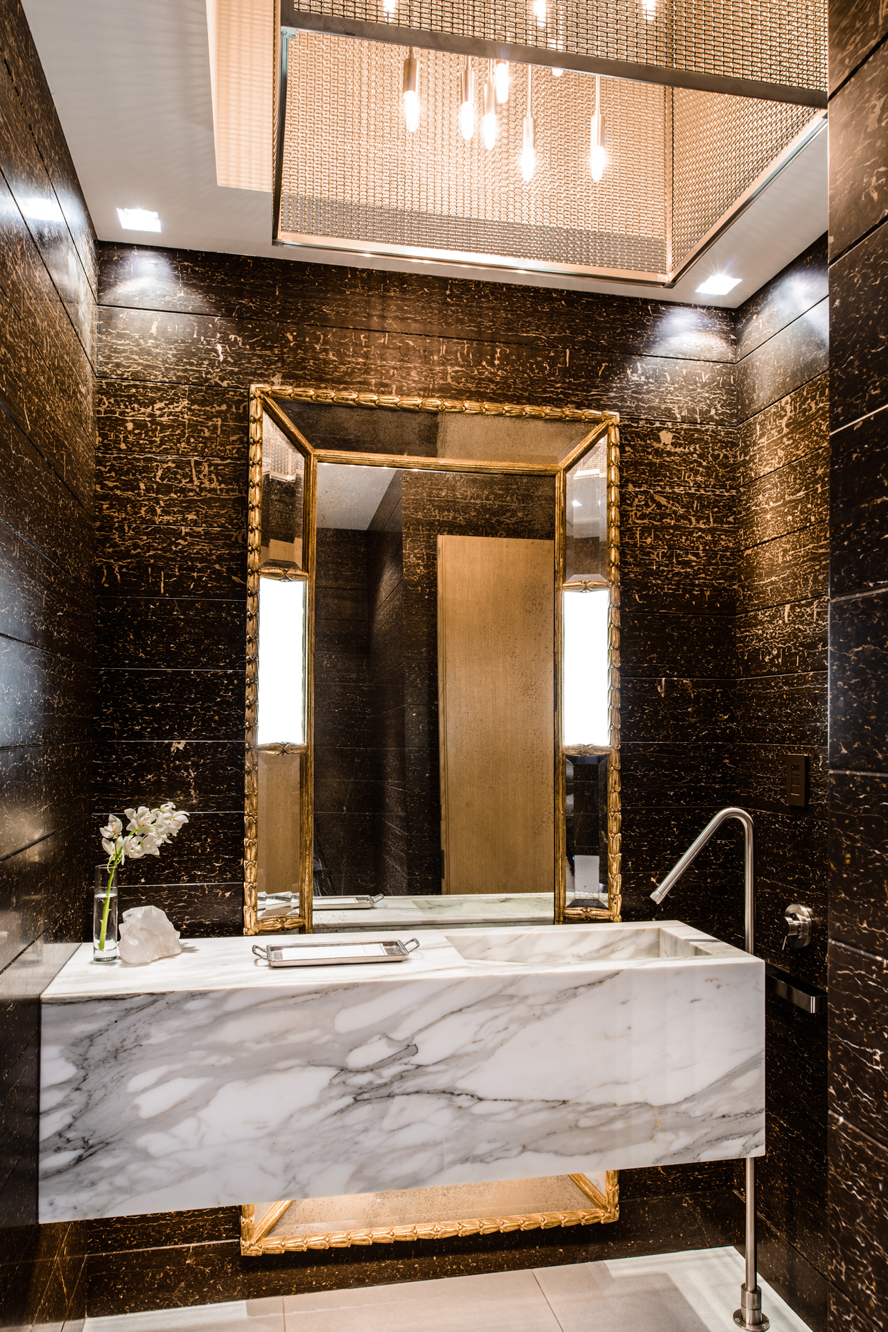
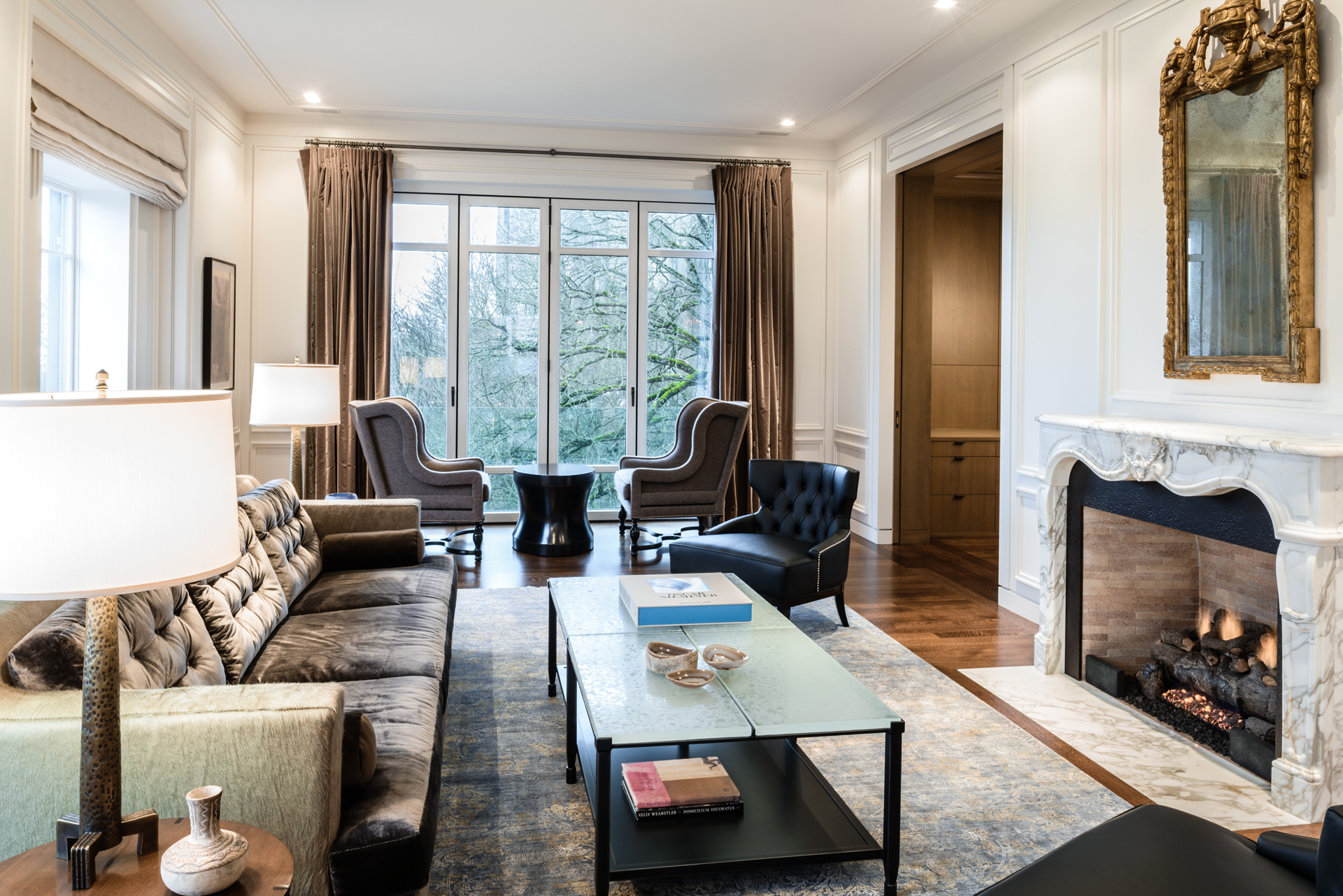
“We used a lot of three dimension, hi-tech design with videos, flythroughs and photo realistic images for the clients throughout the process,” says Werner, “so they would know exactly what they were getting.” He called upon his own architectural background, having grown up in a family of architects, designers and builders, to break down each room for its custom lighting, furnishings, carpet and finishes.
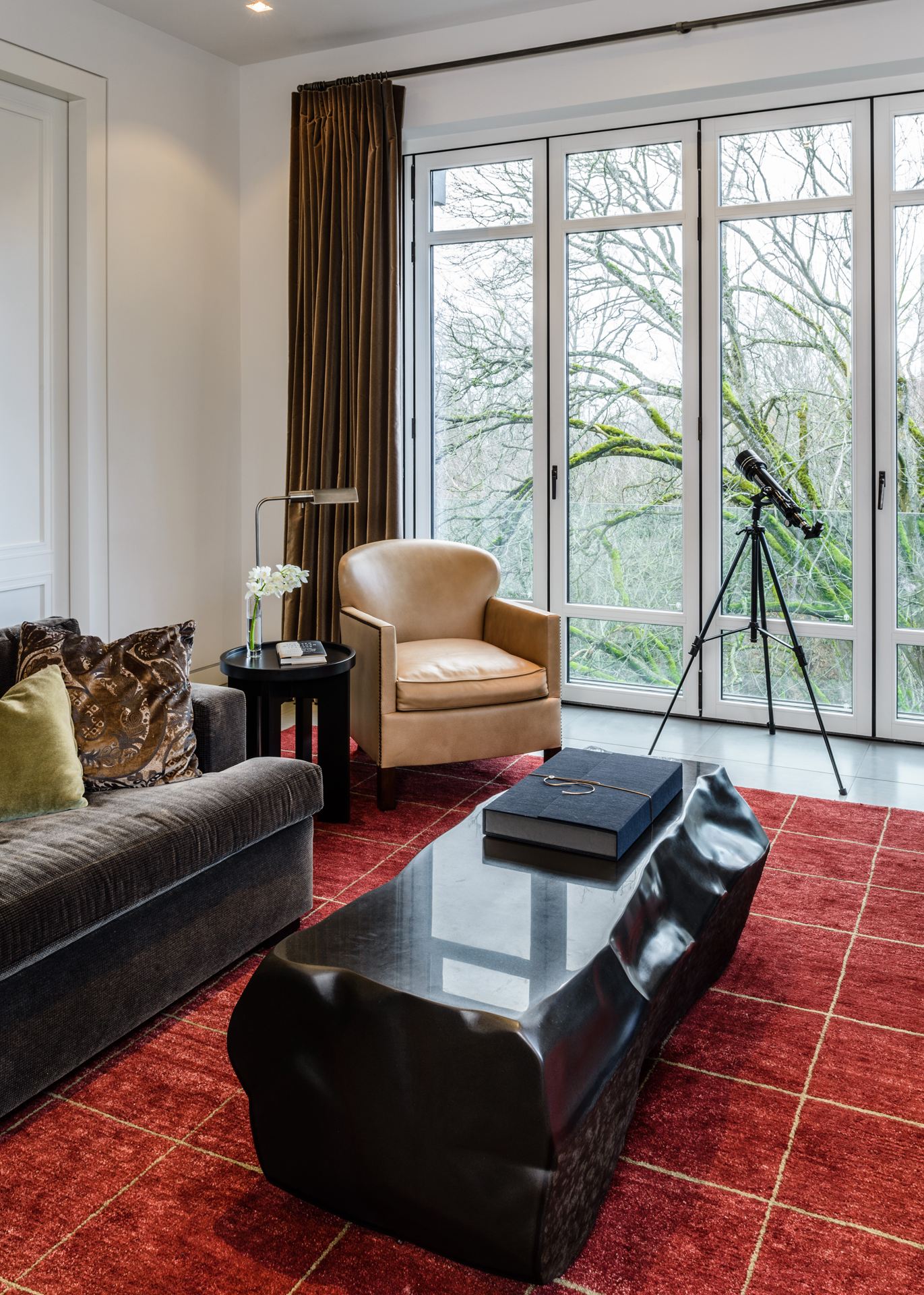
“Everything is custom,” says Werner, “with the scale exactly right. I did all the cabinet and millwork design for the interiors and designed the coffee table in the family room off the kitchen, for example, as a carved solid block of basalt stone that Lambert Marble & Tile engineered and placed with a crane through the new bi-fold Nana glass doors on the new Juliet balcony. You couldn’t put that in a standard home!”
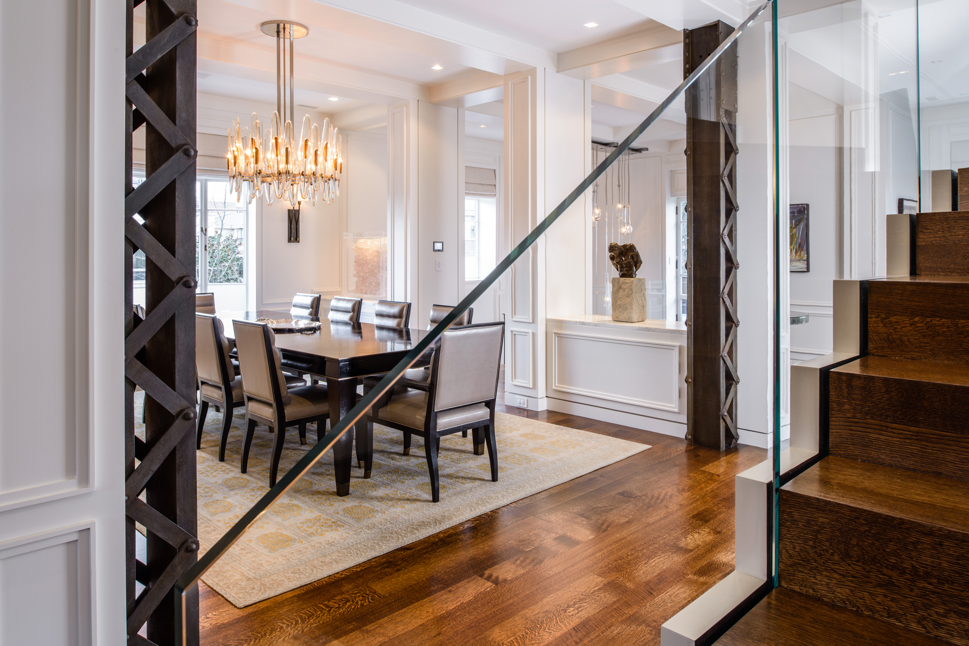
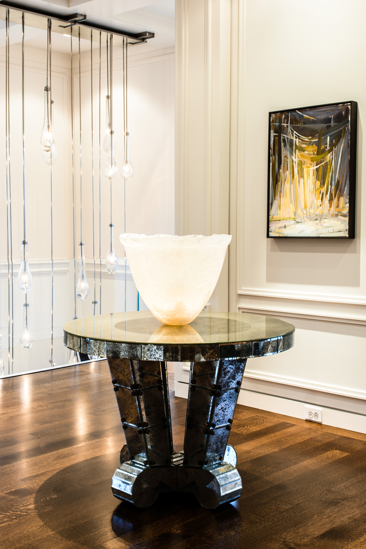
Werner’s chandeliers (part of GCW’s lighting line) run the gamut of über modern – polished nickel and fused glass multi-faceted kitchen fixture – to Art Moderne – his handblown teardrop glass fixture fabricated by Stephen Hirt, with nickel plated tubes of varying sizes hanging from a nickel plated canopy alongside the entry stairs to create visual flow between floors – to an elegant remaking of a traditional design for the dining room. “I started sketching a super elegant style with glass hand shapes made of bronze and a light bulb hidden behind it,” he says. “The larger boat-shaped glass pieces are sandwiched between those two.”
Hill, who convinced Oregon officials to create the Columbia River Highway, used steel girders to build his mansion into a cliff overlooking a ravine, then laid a dramatic concrete roadway up to the carriage house.
“Like Hill, David and Rosangela have highly evolved design sensibilities,” says Silk. “David was raised and educated on the East Coast. Rosangela is from Brazil. They have both traveled extensively in Europe and share a love for modern design and historic architecture. They wanted someone who could merge both, which is reflected in its design which is both uniquely contemporary and timeless.”
“During phase three of the remodel, I recall Capobianco bringing a group of us up to the living room, where the original steel girders were visible during the deconstruction. He was quite insistent that these very industrial columns remain exposed. I thought it was risky at first, but brilliant, and it was all David’s idea.”
“Those steel girders have a bronze patina and the Carnegie steel stamp on them, which gives a sense of history and fit with the aesthetic,” says Capobianco. “The fact that we lived in the house on two separate occasions drove a lot of function from the form. It was painful to move in and out, but really valuable in envisioning what would be optimal for so many unique spaces in the house.”
Werner tied those key structural elements of the exposed steel girders to the complex finishes found in his formal dining table. “There is a direct connection between the exposed trestle columns and the dining table’s mahogany parquetry top with nickel edging and lacquered piano finish,” explains Werner. “The top’s fine layer of materials give it a more modern flare, contrasting with the rougher legs done in a satin finish, highly polished grain, and the super French polished edge, with wonderful old school luster.”
“It’s hard to mix geometry this way and make it come across as true art; otherwise, it’s kind of a disaster.”
Phase four of the reconstruction was the upper penthouse and outside terrace on which SSA, GCW and Richard Hartlage of Land Morphology all collaborated. Silk, who knew the socialite who owned the house previously, notes that the upper floor was added after Sam Hill’s occupancy. “There was a giant roof deck up there, with two feet of dirt, where they played croquet. At some point the dirt was removed and they built the ballroom. It was a stunningly desirable space. The terrace had a 180 degree view, overlooking Lake Union, the
Olympic Mountains, Mt. Rainier and St. Mark’s Cathedral.”
“The top floor deck includes two fire pits, waterfalls, and a Jacuzzi, featuring a Brazilian emerald granite, with emerald and bright blue hues,” Capobianco says. “It’s like a piece of jewelry that glows when sunlight hits it or at night when it’s lit up from within, reminiscent of the emerald blues and greens you see in the Mediterranean.”
Phase five consisted of completing the wrought iron and concrete fence along the property. “Some of the old gates didn’t seal the property,” says Werner, “so we extended them to mark the land as belonging to the whole property.” Trees planted by a former owner were removed by Hartlage to open up the views and celebrate the house from the street. The fence was back planted with clipped Portuguese Laurels, for a very simple, restrained look.
“The neat thing about the house now,” says Capobianco, “are the indoor / out-door spaces on every floor. At every level of the house you can walk out onto a terrace with sweeping views of Lake Union, the Sound and the mountains on one side; and, a rain forest-like green belt on the other side with views of St. Mark’s Cathedral.”
Equally as noteworthy are the original concrete walls in the gym. “We washed away the dirt and grit,” says Silk, “and let the materials come through.” Capobianco calls them a history book. “You can see exactly where the work ended one day and started the next, because the manual process at the time took multiple days to complete a casting.”
All agree. The house has presence. “The work we did,” says Capobianco, “really emphasizes the best part of the original architecture, and it’s just stunning.”
Publication – PORTRAIT MAGAZINE
Published – 2016