 ×
×
PROJECT - WEST SEATTLE RESIDENCE
Located on a bluff in West Seattle with sweeping views of Puget Sound and Bainbridge Island, it’s not hard to understand what first attracted Scott Maxwell to his 2,800-square-foot home. “The reason I fell in love with the house was the area, the view and the potential,” he says. But the house was boxy with small rooms. The two-level, 1950s rambler-like many homes of that time-also had lots of hallways and dark finishes that made the small rooms even more claustrophobic. And since Scott loves to have friends over on weekends, the closed-off spaces were a big problem. Major improvements were needed, so Scott hired local interior designer Garret Cord Werner.
“We wanted to make the house feel larger, to feel like a gracious, open place where he could entertain,” says Werner. Detailed discussions between designer and client helped Werner come up with a layout to address Scott’s desire to create a modern and contemporary home that’s also relaxed and comfortable. Eliminating the closed-off rooms was the first priority. After meeting with an engineer and identifying the load-bearing walls, Werner demolished the interior. Now the only thing separating the public space-the kitchen, dining area and living room-is a show-stopping marble fireplace.

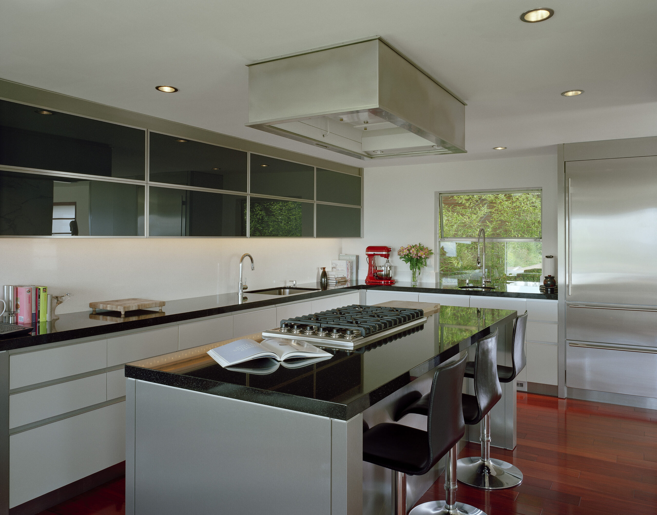
But the key change was moving the kitchen from a dark corner to the center of the house. The gray-and-black streamlined kitchen features cabinets painted in a pewter satin finish. Upper cabinets have interior lighting and glass doors back-painted midnight-blue. “This adds some interest and reflectivity that allows you to see what’s behind you,” says Werner, much like a mirrored surface. The addition of a multipurpose island with cooktop, oven and freezer allows Scott to prepare meals while visiting with guests. “The kitchen is set up in a very social way and that was important to me,” says Scott, who likes to prepare small plates and tasting menus for his friends. “I needed to really use the space, not just have it look pretty.” In addition to the seating at the island, Scott liked Werner’s idea of creating a lounge area as an extension of the kitchen. This casual entertaining spot keeps guests close by but out of the way of the main work zones of the room.
The sofa and chairs in the lounge follow the same simple color palette used in the kitchen. While the lounge area and living room are all about comfort, the dining area is more formal. A 12-foot-long teak table seats a dozen; its wood picks up the dark streaks seen in the rosewood floor. Chairs of black-leather and chrome complete the dining area’s sleek look. With the public spaces complete, Scott and Werner have turned their attention to the more private areas of the home.
The next project: transforming Scott’s master bedroom suite that will open up to the backyard and swimming pool. Until then, Scott can enjoy the revamped bathroom off the kitchen (Now serving as his master bath) complete with a steam shower and extra-deep soaking tub. “You can almost swim in there,” he says. “I wanted the palette really simple,” Dow says. “I didn’t want to do all the coolest things you’ve ever seen in any design magazine.” Slots in walls, floors and even staircases offer teasing reveals between spaces, instilling every room and even the landscape with moment of personal discovery.
The home’s masculine palette is given free expression in the living room, where a soaring concrete fireplace stripped of any ornament save a sculptural steel pokerrises up to meet a vaulted cedar ceiling. Steel soffits fitted with lights encircle the room, lending scale to the space and preserving the purity of the ceiling plane, which consigns heating, cooling and additional lights to a series of discreet slots. Aquartet of French doors supplants the lone window, offering access to a new cantilevered steel deck overlooking the city. The custom lacquered ebony-wood-and-floating-glass vanity with nickel-plated backsplash is a nod to Hollywood glamour. Like the rest of the renovated house, the bath showcases Werner’s dedication to timeless design details and quality. The result? One happy homeowner, who says, “I’ve created my dream house-and that’s what it’s all about.” What was done: -Demolished interior walls but retained the footprint -Relocated the kitchen to the center of the house -Created an open floor plan that allows the kitchen to flow into the living room and dining area -Covered the brick fireplace with Corona marble -Installed rosewood floors-Revamped the bath, adding a
soaking tub and steam shower
Publication – REMODELING + MAKEOVERS
Published – 2008