 ×
×
PROJECT - WEST SEATTLE RESIDENCE

Minimal decor is as much attitude as art. Scott Maxwell’s living room strategically remains serene with a pale palette and a emphasis on sculptural shape rather than accessories. Even walls are hindrance when the attitude is this clean; Maxwell’s designer had all but the essential walls torn out. Above: dark wood and stonework typical of the era were replaced with light materials and dramatic lighting. “Now it’s my dream house,” Maxwell says. Scott Maxwell sits on the sleek. Low sofa of his living room, wine in hand, looking as content as a man back from vacation. But as a manager at T-Mobile, he’s as busy as the rest of usvacations are moments like this, quiet moments snatched when the cell phone’s off. Scott credits his home for helping him feel as though he’s bought a one- way ticket to relaxation, however. “It’s warm and inviting, and it’s my center of the universe,” hesays.
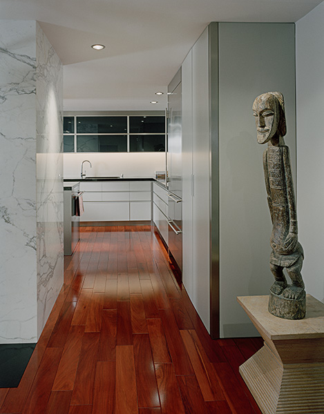
His universe perches on a bluff in West Seattle in a neighborhood that screams the ’50s. Brick homes conjure up hula hoops and the Long Ranger and Tonto lunch boxes. Back then, interior were proudly designed as warrens of closed rooms where windows were just not sacred. “The boxy interior made me cringe,” Scott says. When he bought the home two years ago, it was the site’s sweeping view of Puget Sound and Bainbridge Island that called to him- and his faith in the vision of Seattle interior designer Garret Cord Werner. Both Scott and Werner wanted to lose all those little rooms. After consulting an engineer to identify which were weight-bearing walls and how to secure the structure, Werner had the interior demolished. The footprint became one open, clean slate and remains that way. The living room now flows into the kitchen and dining area, the only semblance of wall being the fireplace- its dated brick elegantly covered in Corona marble. Werner grounded the entire space in gorgeous rosewood floors, searching until he found a batch with pronounced red-orange coloring. It pops like art.
The old kitchen, like most from its era, had a high cringe factor- a dark galley where linoleum was king. During the eight-month remodel, the space was enlarged into a contemporary and functional showpiece. Industrial- grade paint on the kitchen cabinets adds a touch of sheen and glamour. Rich rosewood floors warm the space, as does Chester, a retired Irish Setter Champion who calls the place home. Left: rather than adding a nook, designer Garret Cord Werner anchored one end of the kitchen with stylish seating. It has become the heart of this West Seattle home. The kitchen was relocated from a dark corner to the true center of this universe in the middle of the main floor. Designed to look as tranquil as Puget Sound on a still day, the spaces is hushed in soft gray and black. Even electrical outlets are hidden in a molding below the upper cabinets so as not to rattle visual simplicity. Cabinets are painted in a pewter automotive finish, and top units have glass door back- painted in mid-night blue. They open via an upward bifold with automatic interior lighting. Drawers close silently with a German self- closing system. The dishwasher is completely hidden. “Every inch is used,” Scott says, pulling out a drawer customize to wrap around the sink’s under- counter plumbing. Martini glasses and cheese nibbles are set out near the counter seating, and it’s easy to imagine how well the home works for a large crowed. Adjacent to the kitchen, where the original dining room once stiffly stood, a casual lounge area now beckons with a generous sofa and chairs. It looks hip.” This is the most used area of the house,” Scott confirms. Most entertaining falls into casual spontaneity, but nearby a more formal dining table seats 10. The décor of this area, like the entire home, is strikingly spare. Is it hard to keep an environment this minimal? Would coming home and throwing the keys and BlackBerry on the counter be glaringly gauche?” I find it refreshing,” says Scott, who didn’t mind ridding himself of excess “stuff” to pare down for this home. “My work life is hectic, so a real clean atmosphere here is what I need.” Technology helps. A built-in multimedia TV, computer and lighting system was installed throughout the home. It’s programmed for a variety of dramatic light settings and eliminates the need for many lamps and exposed wires. With the main living spaces transformed, phase two of the remodel is slated for the master bedroom that will open to the backyard and swimming pool, which Scott uses year-round.
The master bath has already been resurrected with new silver- leaf cabinets, a lacquered ebony wood- and floating- glass vanity, and a nickel- plated backsplash. Werner opted for classic vessel sinks versus going to trendy. Smooth black granite walls are interrupted only by two strips where the material is rough hewn to simulate cascading water. Werner attributes the home’s successful makeover to architectural planning. “You can embellish any room,” he says, “but without analyzing it architecturally, you won’t know the potential that exists in your home.” Especially with smaller square footage like Scott’s, style becomes a matter of exacting scale. If flow and furnishings are in sync, it’s like finding the perfect fit for those good bones, Werner says. Here’s the designer’s litmus test: “if the scale is right, s space should feel bigger once the furniture is in- not smaller,” he says. The new master bath is part zen, part Hollywood with silver-leafed cabinet fronts and a vanity with floating custom glass. Even with this touch of class, the room remains quietly understated.
Publication – SEATTLE HOMES + LIFESTYLES
Published – 2007