 ×
×
PROJECT - HUNTS POINT
After enduring a decade in their cracker-box colonial, an Eastside couple was ready to throw in the towel. Despite additions and remodels, the home’s floor plan remained awkward, providing little natural light, view or access to the outdoors. Flimsy hardware and snap-in window grids only emphasized the home’s cost-cutting construction. The couple contemplated a more radical a more remodel but soon decided they’d be throwing money away. “Why would you put a substantial amount of money into a house that wasn’t well-built to begin with?” asks the husband, an investment banker. Resigned to begin anew, the pair approached architect Rex Hohlbein and asked him to design a new house for the site: something solid and old- fashioned, like the Tudor- and Spanish- style home they’d lived in before.
After enduring a decade in their cracker-box colonial, an Eastside couple was ready to throw in the towel. Despite additions and remodels, the home’s floor plan remained awkward, providing little natural light, view or access to the outdoors. Flimsy hardware and snap-in window grids only emphasized the home’s cost-cutting construction. The couple contemplated a more radical a more remodel but soon decided they’d be throwing money away. “Why would you put a substantial amount of money into a house that wasn’t well-built to begin with?” asks the husband, an investment banker. Resigned to begin anew, the pair approached architect Rex Hohlbein and asked him to design a new house for the site: something solid and old- fashioned, like the Tudor- and Spanish- style home they’d lived in before.


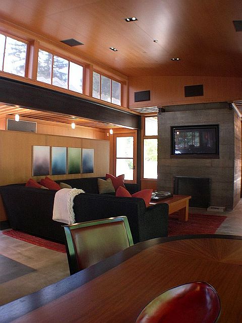
One of the couple’s chief complaints about their former house was that they spent all their time in the kitchen and family room and never used any of the more remote formal spaces. To make certain every space got used, Hohlbein placed the kitchen and family room in the center of the home, allowing other rooms to radiate out from them while remaining in full view. Steel Ibeams and steel channels inset in the floor help delineate transitions within the open plan, as do changes in flooring and ceiling finishes. Because the I-beams rest several feet in front the side walls, the spaces beyond them look like nooks, making each room seem like several smaller ones joined together. “People are afraid of a space being too small,” explains Hohlbein. “But if a space is too big, you lose all intimacy and coziness.” South-facing clerestories flood the kitchen and family room with light, while a wall of windows opposite them overlooks a verdant border of evergreens. The concrete floor stands up to teenagers and a rambunctious black Lab, as does the black chenille sectional stationed in front of the plasma TV.
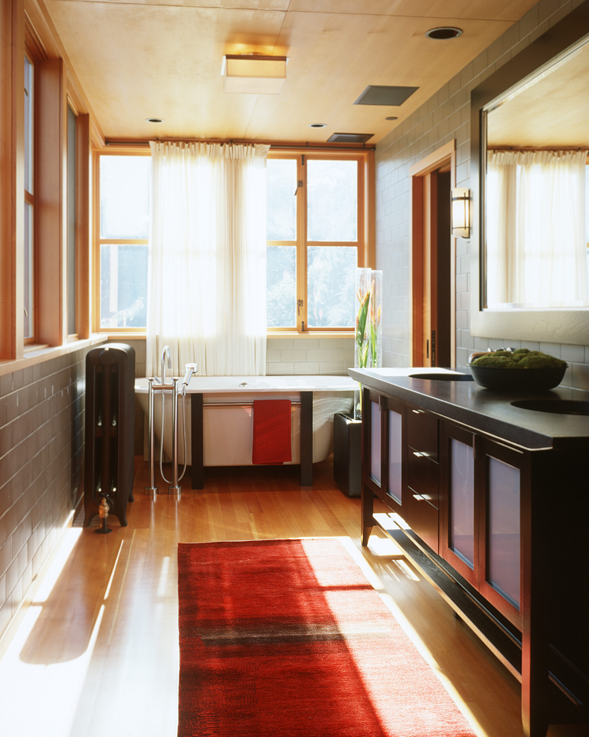
Seattle interior designer Garret Cord Werner, formerly of Ledingham Design Consultants, designed the sectional, as well as the as the accompanying hassocks, whose tops flip over to become trays for halftime snacks. The floors change to ebony-stained oak in the living and dining areas, which Werner furnished with a more formal array of mostly custom- designed pieces in shades of black and white. Large works of modern art provide the primary touches of color. To give the contemporary design a foothold in the past, Hohlbein equipped the interior with old-fashioned radiators, which were sand-blasted and painted a deep bronze color.” It’s radiant heat, and that’s the best kind of heat you can put in a house,” says the architect. A cantilevered steel stairway brushes the top of the living room fireplace in its gravity-defying ascent to the master bedroom and bath, where a free- standing tub beckons beneath a wall of sun-washed windows. “Every time I go in there I smile,” says the husband. The teenager’s bedrooms are located in a shed-roofed wing at the opposite end of the house. Since the kids don’t like doing their homework in their rooms, Hohlbein designed a communal study area in the hallway where they can work within earshot of the kitchen and family room.
Although the house enjoys a view of Lake Washington, equal attention was given to the view of the courtyards flanking the house. Windows overlook the sunny pool area in the southwest corner of the property as well as the shady fireside patio to the north. Landscape architect Kenneth Philp paved the latter with over scale concrete pads fringed with moss- a subtle approach that doesn’t compete with Hohlbein’s dramatic architecture. After owning traditional houses for so many years, the owners admit they’re amazed to find themselves living in- and loving- such a contemporary structure. Could they have pictured this a few years ago? “Never in our wildest imagination,” concedes the husband.” Rex was very good at educating us on architecture.”
Publication – SEATTLE HOMES + LIFESTYLES
Published – 2004